by Michael Sicoli
About Me
Hello! My name is Michael Sicoli. I am a 3+1 Journalism major from Commack, New York. I am a member of the class of 2023, and I plan to master in Sports Journalism. Writing has always been one of my skills, and when I combined it with my love for sports my career path became clear. I played soccer my entire life, playing as far as Colorado in tournaments. I am also a huge NFL fan, which is the sport I hope to cover during my career.
I have thoroughly enjoyed my time at Quinnipiac thus far. I joined the school newspaper, the Quinnipiac Chronicle, early on into the year. I have already written eight articles, seven of which were in the Opinion section and the other was an Arts and Life review of the “El Camino” trailer. After a single semester I decided to become more involved. I joined the eBoard as an associate opinion editor, and so far, I have loved every minute of it. I also joined and participated in intramural sports such as flag football and soccer. Both sports were highlights of my first semester. After being on the Dean’s List for my first semester, I plan to keep this momentum going and have a solid semester.
Altered Self
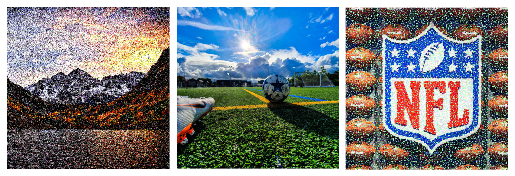
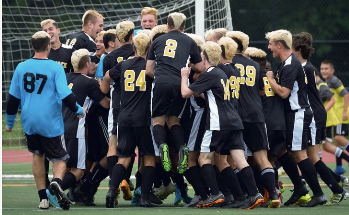
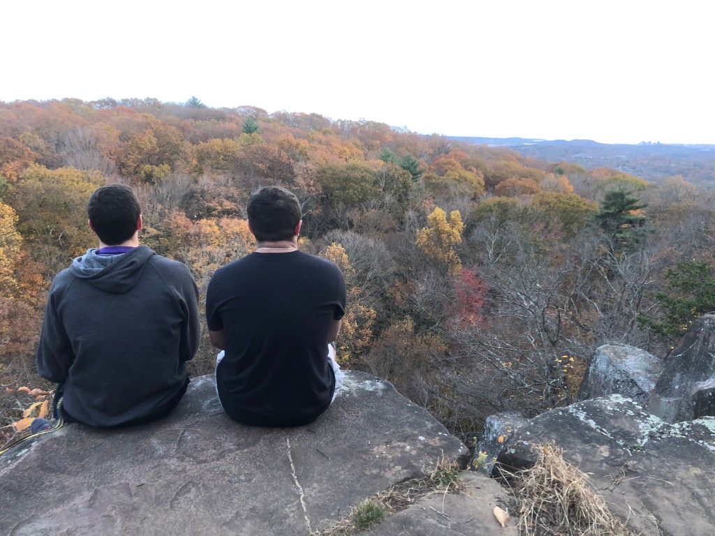
I have little experience in Photoshop, so this was a challenge for me. Understanding how to set the parameters and the background took time but once I understood how to crop images outside of the main document it was not too challenging. Once I set the three photos properly, I began to fiddle with the filtering. Rendering in a random tree was fun, but then I started to use other options. I used the Mezzotint option to make the picture of the Rocky Mountains, my favorite vacation, more like a traditional portrait done pixel by pixel. I then used the Facet filter option to make the soccer photo more defined and lifelike, a sport I played my entire life. Finally, I used the Pointillize option on the photo of the NFL, my favorite sport to watch and cover, to make it appear fuzzy and different.
Original Composition
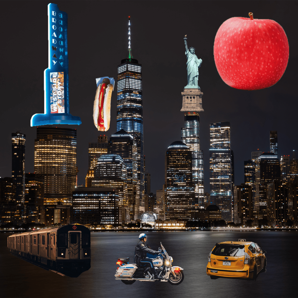
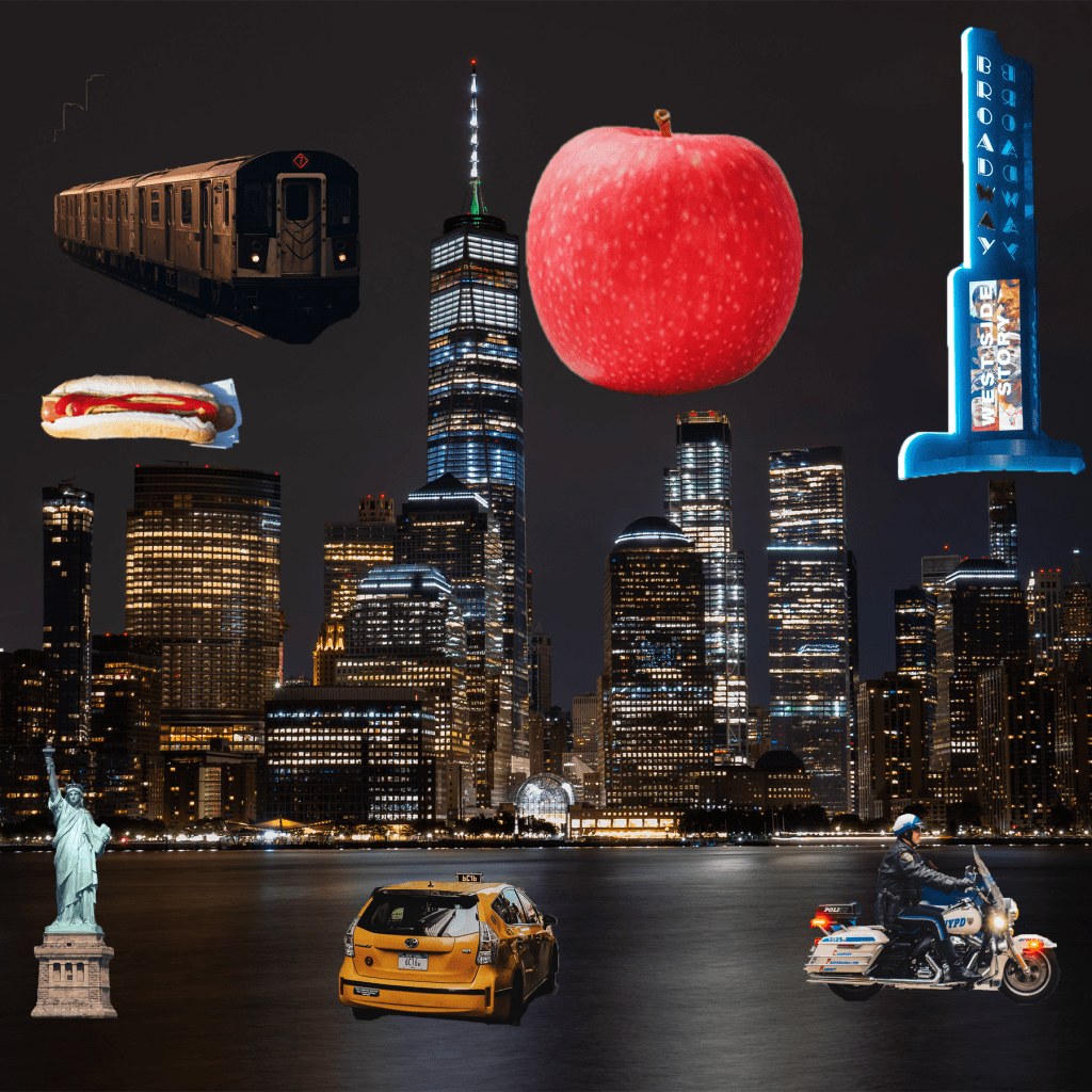
First, I found a background that was both scenic and represented the theme I wanted to convey. A skyline of New York was exactly what I wanted as a starting point. I started to cut out symbols and other images that represented New York in a separate document. The images I chose, like the “Big Apple” and the Statue of Liberty are good representations of New York. I considered where they were relative to the background, so that the cars and vehicles remained near the ground and larger images filled the skyline.
Layer Masks
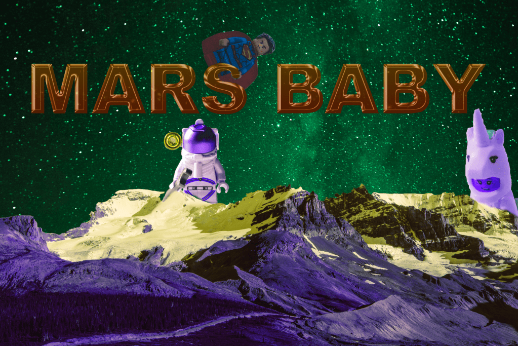
First, I established the background image and enabled the text as a wide, bold option. I made the text 3D and more impactful. I then used the Brush tool on several Lego images with space or imaginary backgrounds to fade them into both the title (Mars Baby) as well as the mountainside. The gradient also provides a terrific contrast.
Social Awareness Poster
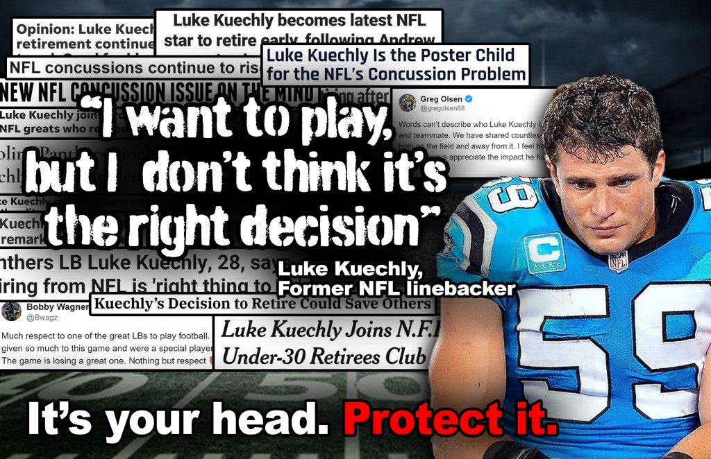
For our social awareness poster, we decided to focus on the concussions that have plagued the NFL for some time now. CTE, a degenerative brain disease, has become a huge issue for the football world as many older and deceased NFL players have been diagnosed with it. Recent stars like Luke Kuechly have retired due to the injuries they have suffered during games. We used Kuechly as the focal point and face of this social issue. The image of him famously being carted off the field with yet another concussion was paired with several “shocking” headlines of him retiring, the most glaring of them being a quote by the linebacker himself. Between the quote and the punctual “It’s your head. Protect it.” line and the bottom this poster ad fills every avenue we wanted to go down with this issue.
Building a Pencil
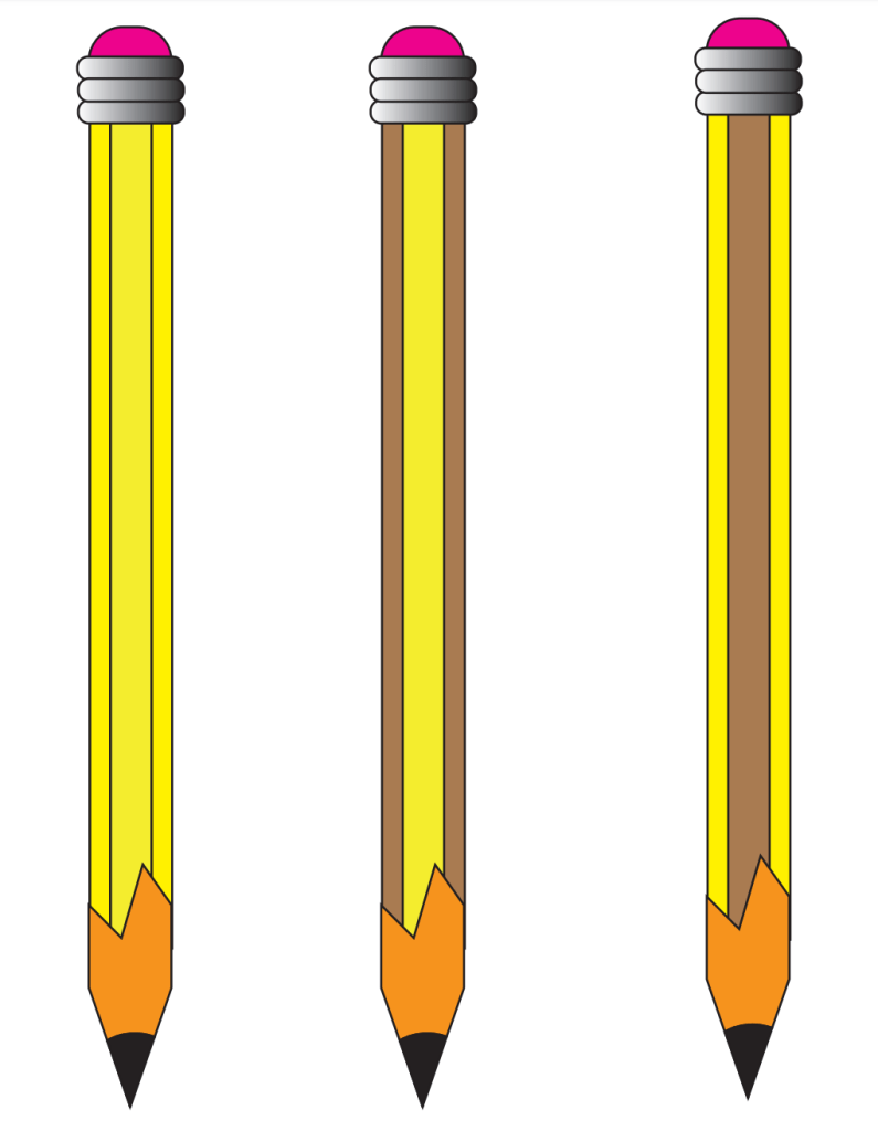
In order to make the pencil, it was important to create the essential shapes. We used smaller rectangles with rounded points, as seen with the eraser, and longer rectangles for the base of the pencil. I also messed around with the colors for my three pencils to give it a more wooden or less wooden look, depending on which one you look at. I made the point of the pencil more jagged as that makes it more realistic. The assignment made me realize how basic shapes can make almost any image if stretched, cut and colored correctly.
Boxes

I really enjoyed this assignment. Using Adobe Illustrator, I created a one inch by one inch square which was then duplicated into a 49 square box. I used several design mechanics to make each square unique and interesting. I used different pointed stars, lines, the paintbrush to draw faces, the text tool to write out messages and more. I then transformed the 49 square grid and reflected in vertically, and repeated that process horizontally. This created a grid that makes the entire image more pleasing to look at. I am pleased with the final result, especially with how the faces seem to be looking at each other.
Tracing Silhouettes
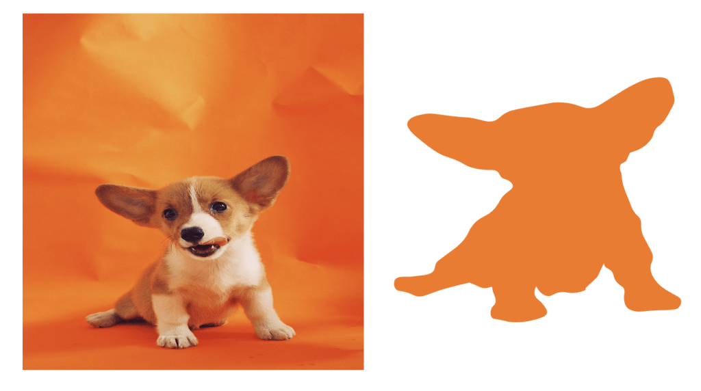
This project was fairly straightforward. After doing some exercises using the pen tool in which I had to create curved lines, I began to make the pear that was previously submitted. Admittedly, this was a little hard for me, but I got better over time. I made most of my curves and lines with the standard pen tool but I frequently used the curvature line tool to buff out mistakes. For my own silhouette, I chose a cute dog. I created the outline using the pen tool and the curvature pen tool and, despite some difficultly, I think the outline is solid.
Infographic
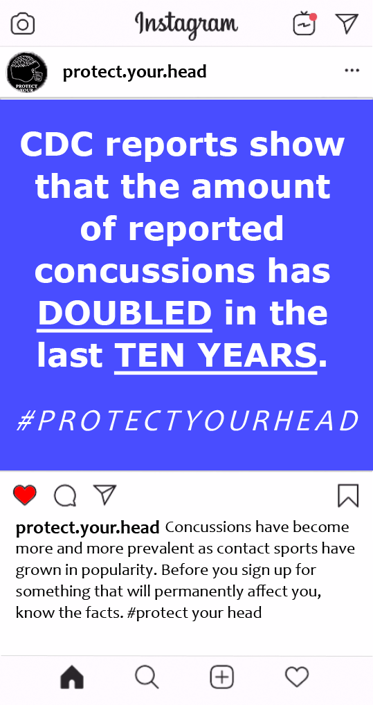
We kept it simple with our concussion message. For the Instagram formatted post, we simply included a factoid that has the right amount of simplicity and shocking awareness needed to be shared. On top of that, we included a hashtag that allows users and viewers to share the message far and wide. It was as simple as overlapping images. The logo was harder to construct, but thanks to some tireless efforts by Xavier, we managed to make it look as good as it does. The cracked helmet with the exposing brain is the perfect message to share in a social awareness push against concussions in the NFL.
Simple Poster

This poster was fairly simple to create. We began by creating two equal boxes that covered the page. I then decided to make one box red and one box blue, two contrasting colors, to stand out. I downloaded the image files from blackboard for the banner, celtics symbol and bottom icon. After turning those white through adobe illustrator, I put them on my InDesign poster and lined them up appropriately. All I had to do then was type in the required message with the best possible fonts. I believe the poster came out very well.
Turtles
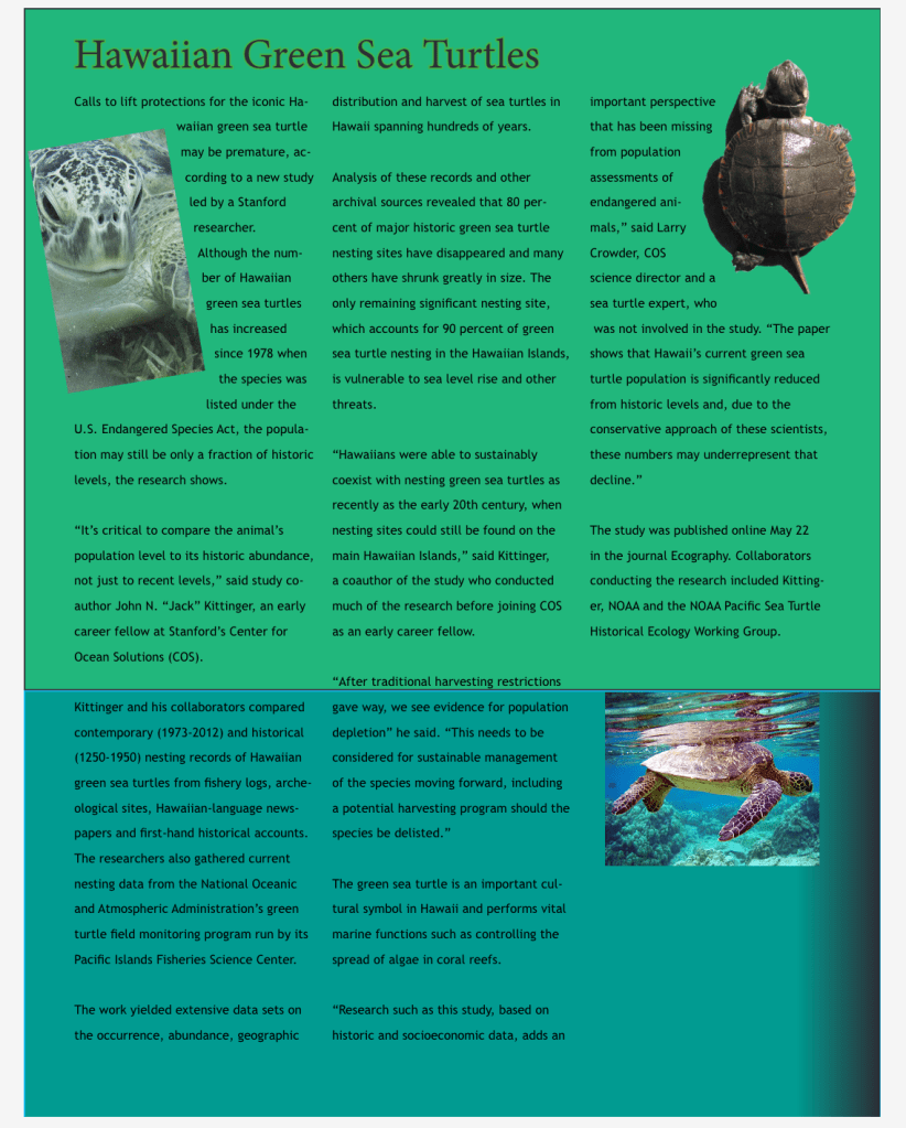
I had a ton of trouble with this initially. I failed to get the Photoshop cut I wanted, but I compensated by adding a green variant on the bottom of the poster. I even cut off the head of a poor turtle by cropping it wrong. But after attending extra help, I was able to get the columns and word spacing, so it does look better now. I fixed the turtle, and moved it around to that the words still flowed freely on the page. After working on it in extra help, I am happy that the poster looks much better now. Thank you!
